One of the reasons I fell in love with movie making (or movie in general) is the fact that it could be something completely complex or straightly simple. The golden rule of movie plot that goes someone-wants-something-and-get-into-other-things-in-between is often dolled up by many forms of storytelling. The storytelling could involve a lot of things, from dialogue to how the scenes are shot, from the wardrobe to how the scenes are cut. And sometimes, Colors.

In one of the most tragic rom-com movie of all time, 500 Days of Summer is not only trying to captivate our heart and ears (the soundtrack are all amazing!), but it also tries to please our eyes with colors. The foreshadowing of the story is brilliantly told by heavy used of colors.

Tom, the main protagonist of the story often wears neutral earthy colors like Brown and Beige towards the story to match Joseph Gordon-Levitt’s Brownish eyes. In one of the montages on the opening of the movie, there’s a shot that compared Tom and Summer’s eyes side by side.

In contrast, Summer uses a lot of bright Blue, also to match Zooey Deschanel’s eyes color. The color Blue often used to portray a loyal and trustworthy character (that’s why a lot of tech companies use this color for their brand). On the other perspective, Blue is also mesmerizing. Everyone should agree, Summer is mesmerizing.

I really love how Blue is shown not only in Summer’s clothes but also her surroundings.

The color of the movie changes as Tom and Summer’s relationship goes. The brown color is used when Tom first shows up. In some scenes, Blue is tinted to show the time when Tom and Summer are still in love.

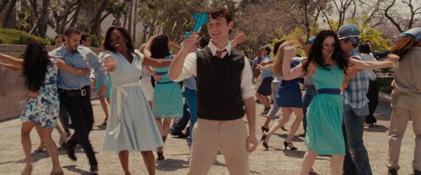
On the most joyous scene of the movie, Tom is the only man wearing Brown in the sea of the dancing blue-ish people.

The tone of the movie shifts back to Brown in the end of their relationship.

And there goes Autumn, in glory Grey-ish tone with a slight of Gold & Maroon color, which (we hope will) fit nicely with Tom :3
Watching movie is one of my favorite ways to find color combo inspiration. Here’s some interesting color that I pulled out from the movie.
Summer Blue

This palette is using many shades of blue and green with calmer and softer choices, which I think works well for a wedding or to get a relaxing vibe in a room.
Fall Season

I’m not fond of earthy colors especially Brown because I’ve never found a way to make it works with other colors. But strangely, this colors works perfectly yet still have that ‘pop’ in between.

One thought on “The Color of Each Worlds – 500 Days of Summer in Colors”